
<div>'s to represent columns.I'm using Twitter Bootstrap quite a lot these days. One of it's nice features is the grid system which makes it easy to design multi-column layouts. And of course there are many other similar grid systems out there (960 grid system being one of the first of them).
Most of them work by aligning floated divs side by side. What many of them are missing though is the possibility to show column separators, i.e. lines in the middle of two columns.
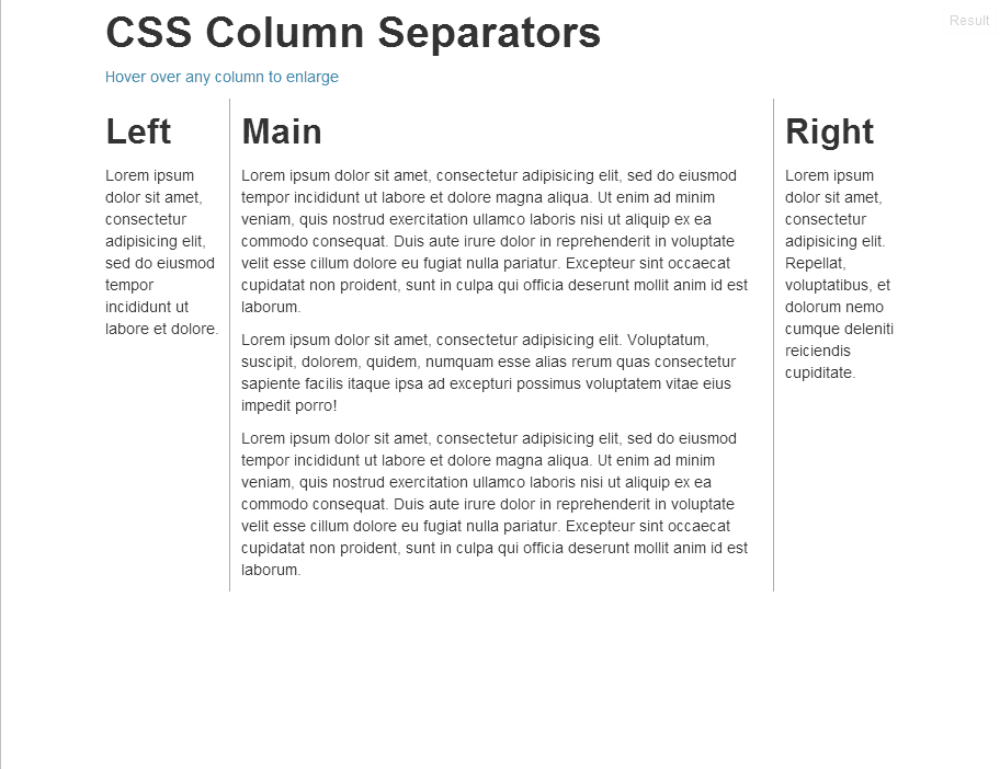
Extend to longest column without markup
The two requirements I had for my project were:
- Extend to longest column I wanted the separator between two columns to be as long as the longer one of them. Note that this is a design decision, there are of course cases where the separator should only be as long as the shorter column (for which I have no simple solution, yet).
- No extra markup This goes by itself, of course I didn't want to insert extra markup in my HTML. Column separators should only be set by applying appropriate
classes.
So basically the result should look like the images below:


Naive approach: border
The first attempt is to use CSS's border property. This sounds easier than it is: common grid layouts use either padding or margin to create the space between columns. But the border in CSS's box model sits right between the margin and the padding, so we would need to fiddle with both values to place the separator in the center between columns. And since most grid systems put some care in getting the values right we will very likely brake the layout, at least in border cases.
Moreover, for our "longest column" requirement we will be using one line to the right of the left column together with one line left of the right column. Using border-left and border-right it would be difficult to make the borders collapse (it might be possible using negative margins, but this will not make things easier...)
Absolute separator
So our solution involves an additional element representing the separator. This element sits right in the middle between the columns, using position: absolute; and the proper right respectively left properties.
And since we didn't want to introduce extra markup, we'll be using CSS's :before pseude-selector to generate this separator element
First attempt
We define two classes, .border-left and .border-right. A column having class="border-left" will have a separator to its right neighbour, class="border-right" separates it from the column to its left.
The CSS for these classes looks as follows
.border-left, .border-right { position: relative; }
.border-left:before, .border-right:before {
    position: absolute;
    width: 0px;
    border-left: 1px solid #aaa;
    height: 100%
    top: 0px;
}
.border-left:before { left: -11px; }
.border-right:before { right: -10px; }
Some notes:
- The classes are applied to the
<div>'s representing the columns. Since we want to position the separators usingposition: absolute, we must make the 'anchor' elements (i.e. the columns) positioned relatively. Note that the CSS standard states that the pseudoelement is inserted inside the main element (just before its content), so absolute positioning works as wanted. - the
leftandrightvalues differ by one pixel. That's because there are exactly 20 pixels between the columns (at least in Bootstrap's standard grid system). Therefore there is no single "center pixel", the center line lies between pixels ten and eleven. So we have to choose one of these pixels, in our example the choice was eleven. - The value for
leftandrightdepends on the settings for your layout system. Bootstrap uses20pxyou might adapt these values if you use different gutter widths. For Boostrap, an elegant solution is to use the LESS sources,@import 'variables'and calcleftandrightusing the@gridGutterWidth. In order to work for even and odd gutter widths, you can doleft: -ceil((@gridGutterWidth+1)/2)andright: -floor((@gridGutterWidth+1)/2).
Both sides, please!
So what if we want a column to have separators on both sides? Ideally we would simply apply both classes (.border-left and .border-right) in this case. Unfortunately this doesn't work right now. For each element, there is at most one :before-pseudoelement, so we cannot generate two column separators (right and left) with the code above.
But fortunately, there is the :after-pseudoelement too. By using this one for the .border-right class, we can generate two separators for each column. The rest of the CSS remains the same. For absolutely positioned elements the order inside the parent makes no difference (well except for z-ordering which is irrelevant in this case since left and right separators won't overlap...)
So the final CSS looks like this:
.border-left, .border-right { position: relative; }
.border-left:before, .border-right:after {
    position: absolute;
    width: 0px;
    border-left: 1px solid #aaa;
    height: 100%
    top: 0px;
}
.border-left:before { left: -11px; }
.border-right:after { right: -10px; }
You finde a complete working example at jsFiddle. The example uses some :hover magic to make columns longer when you move the pointer over it. Just to show the flexibility of the separators...
Whats left...
Bootstrap defines different gutter widths for different media sizes (responsive layout). In order to work, you'll have to set the left and right properties inside the proper @media queries. This is left as an exercise
The approach is easily extended to more advanced column separators. Since you're basically generating a separate element for the separator, you can style it as you wish. Some examples are:
- Use
top:20px; bottom: 20px; height:auto;to make the separators shorter - Or
bottom: -10pxto let them extend below the columns - You can also design them using some bitmap pattern. Remove the
border, give them awidthand abackground-image.
I hope this article was of some use to you. I really like the things you can do just using CSS and I keep discovering new ones on every project I do.
This comment has been removed by the author.
ReplyDeleteI forgot to put the content property in the css. It worked! Thanks
Deletehow to set the left and right properties inside the proper @media queries?
ReplyDeleteCaesars Casino & Spa - Mapyro
ReplyDeleteCaesars 원주 출장샵 Casino & Spa locations, rates, amenities: expert Caesars research, 당진 출장샵 only at Hotel and 광주광역 출장안마 Travel 속초 출장마사지 Index. Realtime 천안 출장안마 driving directions to Caesars Casino & Spa,